17 March, 2011

UK | Project 10

Continuing to look at aeronautical charts and sectional charts, I have been brushing on my understanding of them. Soon I will be flying in no time...Not really. But I have been researching online what they mean, and how they benefit the person who is using them.
I also have been looking at the the flights online of the planes arrivals into the airport.
Gatwick area
Sectional chart info


current Gatwick flights

I have not recorded the flights from Gatwick yet, but when I do I hope to somehow be able to identify which plane is which based on their times of arrival (shown on the internet live) and create my own aeronautical or sectional charts.
I want to be able to make levels of vision within these charts as well. Possibly using pictograms, color, textures, patterns, and lines to create readable (or possibly not readable) charts.
Using zinc lithography I hope to be able to use multiple plates. Using these plates to show different levels of the chart. For example, having a plate for solely the landscape of the Gatwick area, then using a different plate with a different color a top showing.
I could either do the drawing on the plates by hand, or I use polyester plates to transfer images made on my computer to lithographic prints.
More to come!

15 March, 2011

UK | Project 10

For project 10 we had the opportunity to choose from ten different briefs. They ranged from typography and editorial to information designs and interactive pieces. Out of these 10 I chose to do information design, info flow. We must must choose from the fallowing within the brief:
1 Care stopping at stoplights
2 People entering a station
3 Busses arriving at a deport
4 A football crowd leaving a ground
5 Aircraft movements at Gatwick

Then we are to collect information, and research first by video taping the serino we wish to record (for 30 sec, 1 minute, or five minutes) It's very open really. I have chose to do the Aircraft movements at Gatwick.
Below is honestly just random doodles and ideas I sketched out yesterday. I am excited to get my informations gathered. I am leaning towards the mathematics of a plane moving, such as how they land (as you can see my little sketch of the plane fallowing a path in a spiral, which is how they land) Also interested in the different airlines, where they are traveling all over the world, air miles, directions...and so on.
This is a very experimental brief, the final pieces dont necessarily have to make sense. Though I believe I want to push towards making them useable, and able to be used to gather information.

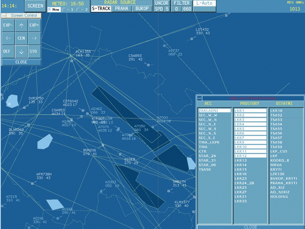
These are just a few images I was looking at. I really enjoy how abstract and mathematical these screen shots of a air control screen look. Somehow I believe they would fit nicely into my brainstorming:


Lastly, I am going to use zinc lithography for this. Possibly creating a series of A1 posters showing these maps, diagrams, or whatever I come up with with. 
Pretty excited.
Oh and this is my 2nd lithographed piece: 
Yes, it's Julie and I. Yes, those are halos. Yes, it's quite creepy.


04 March, 2011

UK | Personal Project

Personal project. This basically consists of choosing anything you want to focus on. What you as a design would like to focus on.
I have been thinking and doodling a lot in information graphs and information about what I do on a daily basis. This lead to to decide on creating diagrams, lists, collecting receipts, etc about my everyday life in another country.

But after beginning to doing so, I felt like I wanted to include so much more than I believe an informational graph could show. I wanted to include my UK living in diagrams, but also add photos, thoughts, writings, and just things that I feel our entertaining and give an idea about my current location.
This once informational manuel is now turning into an editorial project. I first begin to think about my everyday routine then break sections into categories, allowing me to continue to gather further information in these areas. Like illustrations, photos, and writings. This will allow me to obtain more information in these areas, and really focus on the details.
 Below is just one of the many tests I have done when dealing with location and distances. Showing the distance of about 200 miles in the US (Kansas City) and the distances in the UK (Brighton). This was eye opening. You know of course the US is huge, but when comparing it to your current location and the place you once lived, really makes you think. I then thought about the distances I travel in the UK and the distances I travel in the US. Very similar, but everything is much closer together here in Brighton, compared to Kansas City. Realizing also that I travel about the same amount of distances, but using a car in the US, rather than by foot.
Mapping out my common routes of both places*, I thought looking into psychogeograhy would be an interesting take to include. Beginning by mapping the routes out and combining the paths. Analyzing locations that would be visited if I was to be using my daily route in Kansas City to the geography of Brighton. Also separating them in different areas, and placing them on a graph paper and overlaying places of interest. (pictures to upload)
*realizing that America is like one giant grid


More to come. Layouts, photos, and more.

UK | Typeface design

We were given five choices of projects. I have chosen to design my own typeface. I decided to do a modular font.
After failing at my first try I decided to start over and create new rules.
Began to use basic shapes to create letterforms. After deciding I really wanted to use the grid base, then set some rules for myself to makes sure the family was cohesive. 
rules:
lower case
common breaking of letterform
2x4 grid structure
numbers would fallow the same grid, being the same height of the cap height


This is what I have currently came up with:

Crit for these is today, having to have each letterform printed on a A4 (approx. 8.5x11)
And a simple A1 poster (black and white only showing the entire font family, and including a short paragraph that uses the numbers, letters, and punctuations.  
(iterations)


13 January, 2011

UK | Tower block progress

Gathering information most on the internet, I found a random website that allowed me to view basic stats on the tower blocks in the Brighton area. Below is an example of one of the lists:

After creating the map, I added my plots, and a key at the bottom of the mapping. Using color coding to separate the categories, complete, proposed, cancelled, and on hold.
I can't say I am 100% happy with my final A1 sized poster. But after tomorrow's crit, I hope to receive feedback that will improve my piece. 

07 January, 2011

UK | New beginning

Starting a new semester of design... in another country.
I am currently studying at the University of Brighton in the UK.
So far it has been an interesting move, finding classes, moving in a new flat (soon to be moving again), and learning the ways of British education. But it's honestly been great so far.
Anyways...
We have gotten our first assignment on the first day of out studio class (Tuesday)
Julie and I outr being plopped into the middle of the year, so basically we are starting on Project 6.
Mapping Brighton:
Documenting through photography, video/film, drawing, text or symbols the category of information I have drawn from a hat (Tower Blocks) I am now to gathering information about these tower blocks within a two mile radius of the 'Clock Tower' in central Brighton. I will record this information, find links about the subject and create a large format folded map sheet, chart, interactive piece, or short film.

I have currently gathered information about these residential tower blocks, including height, number of flats within, location, a list of completed, proposed, and canceled constructions of these tower blocks, and history about how they were created.
More to come.

Track of the moment: 

Tim Armstrong - Wake Up

02 December, 2010

Hot Sun Fondation

http://kiberafilmschool.blogspot.com/

Thank you for the opportunity, Hot Sun!

30 November, 2010

17 November, 2010

NA | Post Demo with Garret

After going through the demo, I have decided to go with Idea #1.
Time for them sketches!

16 November, 2010

NA | Communication Diagram Continued

After finalizing our communication diagrams from VIS LANG, we are now using them in NARRATIVE class. Our project is to create an interactive communication diagram, showing how the system of communication works.

IDEA #1: Make my diagram grow. Start at Source A and have the user be able to click and make the loop grow, all while popping up descriptions and labeling of the diagram. This would able the viewer to read at their own pace, while learning the way the diagram travels.
IDEA #2: First view would be the fading in of my diagram, then zooming down to the Source A and traveling along the loop/channel path in a 3D view of the model. The descriptions would pop up as it travels, allowing the reader to read it. This would not allow the user to have control. At the end, upon returning to Source A, the view would zoom out.
IDEA #3: Having my diagram be static and black and white muted form. Then as the viewer places their mouse over the communication element, it would glow with color, and telling what it is (Ex: MESSAGE, ENCODING, etc) If the viewer chooses to click the glowing element, it would pop up the description and give examples and further information about the element.

 I am aiming towards #1 or #3. Mostly because I like the fact that the viewer would have the power to choose what they want to learn, and how fast they want to proceed. Though #1 is more appealing because it would have more motion and interaction.

VIS LANG | Communication Diagrams

After reading about the systems of communication and studying the fallowing diagrams:


We then began to create our own, using all of the information we gathered form the lectures, reading, and diagrams.
first drawing them, then creating digital. These are a few examples of this process. I made sure to incorporate the Source, Transmitter, the message, receiver, and noise. But at the time I had forgotten the channel and channel. After studying the information again. I began to redo my diagram.


 I went with using somewhat of a looped communication diagram. I began to experiment with gradation and color to separate specific elements within my diagram.
Then I worked on the final details of my diagram:
Then I tried using a key to show my digram's elements. I decided this wasn't as user-friendly as it could be...

I then placed the labels next to the corresponding pieces. I liked this better, But to finalize it, I added lines and more color to text.

Finally arriving at this:
Soon I will document the next steps we are taking with the digrams. We have used these models to understand and practice by creating tools the relate to the simulation we participate in a few weeks ago.
My partner, Ben and I are now creating a map that will focus on people of poverty, and helping them with their unfortunate situation. We will be creating a map of the bus routes of the Kansas City Metro, making them easier to read, gain knowledge of riding, and create a system of communication to better them.

10 November, 2010

NA | Final 15 sec opener and logo build for KiberaTV


FIRST OFF, VIMEO DECIDED MY FILE WAS TOO BIG. SO, I WILL SOON BE POSTING IT...ONCE I GET IT COMPRESSED CORRECTLY.

Within my 15 sec narrative for my opener, I decided to show Kibera and describing the people of Kibera. Using the words "community" and "unity". I believe this sums up and shows the view that the people of Kibera are working together. Working together when it comes to trying to better their lives, and working towards spreading the news to the rest of their community. For this project I used Affect Effects CS5.
I have honestly learned a lot about AE, and I am really enjoying it. I really enjoyed how easy I was able to do transitions between one frame to another. I learned the importance of smooth transitions, and how it effects the composition. I had a lot of trouble with this, I believe my narrative could still be tweeked more when it comes to smooth transitions. 
Within my piece I wanted my transitions to be smooth and unit the text and imagery. I used direction and motion throughout the piece to direct the viewers attention and lead them.
My process was similar throughout the planning and creation of the animation. But when it came down to execution. I had a hard time deciding what I ultimately wanted to do. I think it would be best to do more planning next time. Production of this piece forced me to search and learn new things in After Effects. I highly enjoyed trying to figure it out. Most of the time...
Also learned that my frist time isn't going to look like any of the tutorials ;)
 A FEW SCREEN SHOTS:
Comm/UNITY

Part of my KiberaTV logo build

Logo bu and title bar in the environment 

08 November, 2010

NA | Oh Poo...

Yup that's right, changing my mind ONCE AGAIN!
I am so indecisive.

01 November, 2010

NA | Final Storyboard

Final storyboard for my 15 sec introduction to Kibera TV. The idea is to use a drawing effect, or another stop animation to show the images within the storyboard. I wanted to give the effect of it being created, like drawn. I have not decided if I am going to do this piece digitally and stop animation, so I may do them both, then decide or maybe combine them somehow.