31 October, 2010

VIS LANG | Reading


A Communications Primer (1953) by Ray & Charles Eames

The beginning of the film starts with the explanation of communication and that we all should be aware how we use communication in everyday life. The introduction of the graph we discussed in class is shown and explained:

Noise is introduced and they gave the example of reading a book. Starting with the source (the book), then to the transmitter (the printed page), then the receiver (the eye), then the destination (the brain). The noise could be a sound interrupting you from reading and gaining understanding or what you are reading.
Another example was the painter and his painting. Using art as a form of communication. The source is the thoughts, ideas, and way of thinking of the painter, the transmitter is his talent, the message would be the painting itself, the receiver would be the people looking at the painting, and lastly the destination would be the what the person thinks and feels about painting. 

Source: the idea or thought behind the message
Transmitter: the way one communicates the thought or idea
Channel or Message: what needs to be communicated
Receiver: the people/person receiving the message/channel
Destination: the way the receiver perceives the channel/message
Symbol: the abstraction of an idea
(Ex: storm warning flag. originally the simplicity of shape and color to show warning)
Symbols also change and involve. 


Visual Communications from theory to practice

Three levels of communication and it's processes.
1) Technical: Media that is being designed and who it is directed to. Are we communicating the message clearly? Does one need special knowledge to understand the message?

2) Semantic: Can it be made simpilar? What can be removed from the message until the meaning is lost?

3) Effectiveness: How does the message/channel effet the behavior of the receiver? 

Feedback: helps a designer refine their work and gauge how effective their work is.


The Berlo Model of Communication

 The relationship between the source and the receiver. 
Source is broken into five different communication, knowledge, social system, and culture.
Communication skills:
decoding (listening and reading)
encoding (speaking and writing)
both (reasoning or thought)


Message: content and structure
Receiver: knowledge, attitudes, social system, and culture


28 October, 2010

VIS LANG | Process


My first sketches of my chai tea concentrate in logos and pathos, as you can see were very rough. I had a hard time getting a solid idea.

When I got to my second iterations I came to the idea of using ethos to show the consumer that you could in fact get more for your money then buying a latte at a coffee shop. I also had not thought of pathos being shown as relaxing and relaxing till my second iterations.

LOGOS: 
I started out just sketching out different coffee cups and ways to render.

  I came up with these pen and watercolor drawings to being my ethos packaging design:

ink and watercolor of cafe latte
ink and watercolor of tea cup
At this time I was thinking I was going to use both of these images to show logic, that in fact you would get "more for your money." I wanted to juxtapose the latte bought at a coffee shop and the at home experience of making your own chai latte for a lesser cost.
text iteration in print

After deciding I was of course going to use these hand-rendered elements, I thought it would be a good idea to use hand written text.
text iteration in print and cursive

 Along with the text, I created baners to house my titles and such. I iterated how many ribbon peices I would have, color, and the "tails" of the ribbon


Iteration #1

Iteration #2
 PATHOS:

 At the beginning I wanted my pathos packaging to show the feeling of relaxing and calmness when drinking this tea. I decided to create mandalas to show this.
I went through a number of iterations with color, symbolism, and shapes of the mandalas.

began to use the "ohm" symbol within my mandala
Iteration using a tea cup within the mandala
 Still working on the mandala I began to work with type. At first I tried the hand written text. But then decided use vectored type would be best for this packaging. 


Iteration #1


Iteration #2


FINAL

Making it to a definite choice I created two packaging designs that portray the the logos and pathos modes.


BTW: Blogger totally messed up my format :(

22 October, 2010

VIS LANG | Iteration, Pathos/Ethos/Logos | Packaging

Coming close to the final for our product packaging. 
This was the product I went with, Oregon Chai Latte Concentrate. Which was categorized as logos. My task was to redesign the packaging and demonstrate ethos and pathos.
(As you can very well see this is THE ORIGINAL packing for the chai tea)  ;)
For ethos I went with an economical approach. Saying that for your cafe chai latte (Like at Sbux), you could get this chai concentrate that creates eight cups for the same price. Well actually in the examples I will be show you, I have much more then eight cups shown. So, that of course it something I need to look into and change. I also am going to look into having the price written on the packaging. Okay, so Ethos:


This is just an ideal of what my final picture will look like with the right packaging. This of course is not the final by any means, but it is making it's way. Everything on this package was originally hand drawn then vectored on the computer.


For Pathos, I was going for the feeling of calming, meditation like, zen. This on has a long way to go. My colors are off, content needs to be thought out within the mandala. The type needs to be vectored, no hand rendered text. But it will look good soon, I promise ;)


These colors are far too similar to my other packaging. The text is off too. Bleh.. 
I'll get it!

19 October, 2010

Working on my logo bug and bar underneath the video.
Ekk. 45 layers and counting!
Getting use to After Effects. Lovin' it.

12 October, 2010

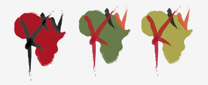
NA | Final Logo for Kibera TV? (Maybe...)


Other than the opacity problem in the strokes (Which I have not figured out why the strokes are shown as being transparent)
I think this address the Africa background problem that I had in my last iterations. I highlighted Kenya, where Kibera is located. 
I also made the Africa a solid shape, as well as Kenya.

11 October, 2010

VIS LANG | Progress

Messing around with type on my scanned imagery. This type is totally wrong, just mostly looking at the type's color on the paper.

Another messing around moment. I was going off the concept of a person meditation, the string of the tea bag emphasizing their features. VERY ROUGH. 

I wanted to use mandalas to show calming, and meditation like, to give the feeling that this tea was calming, and relaxing. I would use tea bags (as shown) and possibly teapots and tea cups inside the mandalas.
But after the crit I realized I can't use tea bags. Because the product is chai concentrate. So it's not tea bags, it's liquid.


A few paper tests I did, then used ink... just a thought.

PATHOS
 (calming, meditation, soothing, concentrate)
ETHOS
(more for your money and using the USDA ORGANIC logo)


This is a picture I drew Karen. I thought she should try this approached for her Neutrogena facial bar. Pretty good idea, right? Haha

08 October, 2010

VIS LANG | McCoy Lunch Lecture

What I learned: Well as simple as it sounds I learned how important it is to incorporate user experience within design.
As a designer I believe I do take a step into thinking about what the user's input would be. But I enjoyed how McCoy really emphasized it. 
He had different steps one could go through when designing. Very helpful, and something to try more often.


Just points McCoy mentioned: 

People Centered Design
and Modern Experience

What role do this products take, how do they interact with people's life? How do they use these technologies?

Start from the experience of the user. 

activities, environment, interaction, objects, users
Asking the questions, staring at the wall in the studio and just thinking about it, or actually go out and do it. Better user experience. 
cognitive mapping; how people view their space. Get on paper about how the person views their space. 

06 October, 2010


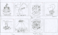
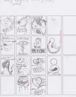
The first few pages are of my first round. Then there is the second round below. Honestly, I have not fully grasped the direction I am going to go with 
Trying to decide what would be the best direction to go in, the baby wipes, almond butter, or the chai latte concentrate. 
My next step is going to do some sort of a matrix. to further decided on my subject, and think of ideas that wont be so obvious and interesting.


Oregon Chai Tea Latte Concentrate

Pathos: 
1) Going off the concept of being comfortable and relaxed, while drinking a cup of chai tea. Like in a cafe setting, or in your own home by the fire.

2) Second concept is the feeling of being peaceful and healthy, example is of a person doing yoga poses is shown above.

3) The last concept of having the viewer feel like they are actually in the region where the chai tea originally was grown. The examples above show being in the mountains, or have rows of chai plants.

Ethos:
1) First concept would be playing off the trust of the USDA ORGANIC logo on the packaging. Emphasizing all natural traits, and the "certified" sticker"

2) Emphasizing that this product is concentrate. More for your money. 


04 October, 2010

NA | Logo Progression

I have been working on the logo for Kibera TV. I am leaning towards the lettering with the circle or Africa shape. With the color I have been trying to use similar colors to Kenya's flag, and colors that relay to Africa. As far as the painting/handmade/drawing feeling, I was continuing the idea of these youths creating something, creating this community broadcast.

Also had tried using a TV image and just the letter K. Not my favorite. Ha.

03 October, 2010

NA | Combined Narrative


Project 5; Kibera TV from Loren Cook on Vimeo.


Final presentation for my combined narrative. I shortened each music clip to make sure they fit into the 25 second stop animation. I also added different colors to some slides, and repeated a few. This was to make the animation seem as it was moving to the beat of the music.
I think overall the two pieces fit pretty well together.


WHAT I HAVE LEARNED FROM THIS PROJECT:
As far as editing the sound and image, I don't believe I learned much more then before project 5. But when it came to editing these two pieces together, I had to really push to make it interesting. I could have easily placed these two channels together and made it work without much editing. But honestly, it was boring and expected. All in all I learned that combining two separate channels to make something interesting takes more time, but turns out so much more pleasing.