I have been working on the logo for Kibera TV. I am leaning towards the lettering with the circle or Africa shape. With the color I have been trying to use similar colors to Kenya's flag, and colors that relay to Africa. As far as the painting/handmade/drawing feeling, I was continuing the idea of these youths creating something, creating this community broadcast.
Also had tried using a TV image and just the letter K. Not my favorite. Ha.


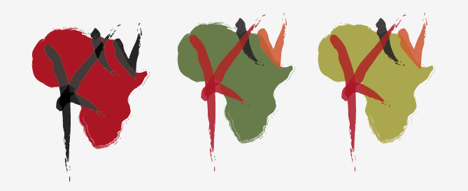


loren, i agree that the circle and the africa ideas are the strongest right now. the idea of the youths creating something is good, and more meaningful than showing the continent of africa, but at least africa tells where it's coming from. but then again, it would be like a local news channel using the u.s. in their logo -- kind of odd. i like the fact that the africa shape gets a lot of color into the mark.
ReplyDeleteon the circle idea, i think you need more contrast than you currently have. both the type and the circle are made with the same tool, and are kind of saying the same thing in terms of the expressive quality. you might be able to say two different things with different types of marks. hopefully that makes sense. in terms of legibility, the overlapping area is problematic because the contrast is low between the circle and the type. this will have to be quite legible at very small sizes. keep that logo bug in mind, particularly when people view it at the small size on youtube or vimeo or whatever.