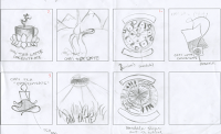
My first sketches of my chai tea concentrate in logos and pathos, as you can see were very rough. I had a hard time getting a solid idea.
When I got to my second iterations I came to the idea of using ethos to show the consumer that you could in fact get more for your money then buying a latte at a coffee shop. I also had not thought of pathos being shown as relaxing and relaxing till my second iterations.
LOGOS:
I started out just sketching out different coffee cups and ways to render.
I came up with these pen and watercolor drawings to being my ethos packaging design:
 |
| ink and watercolor of cafe latte |
 |
| ink and watercolor of tea cup |
At this time I was thinking I was going to use both of these images to show logic, that in fact you would get "more for your money." I wanted to juxtapose the latte bought at a coffee shop and the at home experience of making your own chai latte for a lesser cost.
 |
| text iteration in print |
After deciding I was of course going to use these hand-rendered elements, I thought it would be a good idea to use hand written text.
 |
| text iteration in print and cursive |
Along with the text, I created baners to house my titles and such. I iterated how many ribbon peices I would have, color, and the "tails" of the ribbon
 |
| Iteration #2 |
PATHOS:
At the beginning I wanted my pathos packaging to show the feeling of relaxing and calmness when drinking this tea. I decided to create mandalas to show this.
I went through a number of iterations with color, symbolism, and shapes of the mandalas.
 |
| began to use the "ohm" symbol within my mandala |
 |
| Iteration #2 |
FINAL
Making it to a definite choice I created two packaging designs that portray the the logos and pathos modes.
BTW: Blogger totally messed up my format :(


