
03 December, 2010
02 December, 2010
30 November, 2010


22 November, 2010

17 November, 2010
NA | Post Demo with Garret
After going through the demo, I have decided to go with Idea #1.
Time for them sketches!
Time for them sketches!
16 November, 2010
NA | Communication Diagram Continued
After finalizing our communication diagrams from VIS LANG, we are now using them in NARRATIVE class. Our project is to create an interactive communication diagram, showing how the system of communication works.
IDEA #1: Make my diagram grow. Start at Source A and have the user be able to click and make the loop grow, all while popping up descriptions and labeling of the diagram. This would able the viewer to read at their own pace, while learning the way the diagram travels.
IDEA #2: First view would be the fading in of my diagram, then zooming down to the Source A and traveling along the loop/channel path in a 3D view of the model. The descriptions would pop up as it travels, allowing the reader to read it. This would not allow the user to have control. At the end, upon returning to Source A, the view would zoom out.
IDEA #3: Having my diagram be static and black and white muted form. Then as the viewer places their mouse over the communication element, it would glow with color, and telling what it is (Ex: MESSAGE, ENCODING, etc) If the viewer chooses to click the glowing element, it would pop up the description and give examples and further information about the element.
I am aiming towards #1 or #3. Mostly because I like the fact that the viewer would have the power to choose what they want to learn, and how fast they want to proceed. Though #1 is more appealing because it would have more motion and interaction.
VIS LANG | Communication Diagrams
After reading about the systems of communication and studying the fallowing diagrams:


We then began to create our own, using all of the information we gathered form the lectures, reading, and diagrams.

first drawing them, then creating digital. These are a few examples of this process. I made sure to incorporate the Source, Transmitter, the message, receiver, and noise. But at the time I had forgotten the channel and channel. After studying the information again. I began to redo my diagram.


I went with using somewhat of a looped communication diagram. I began to experiment with gradation and color to separate specific elements within my diagram.

Then I worked on the final details of my diagram:

Then I tried using a key to show my digram's elements. I decided this wasn't as user-friendly as it could be...

I then placed the labels next to the corresponding pieces. I liked this better, But to finalize it, I added lines and more color to text.

Finally arriving at this:

Soon I will document the next steps we are taking with the digrams. We have used these models to understand and practice by creating tools the relate to the simulation we participate in a few weeks ago.
My partner, Ben and I are now creating a map that will focus on people of poverty, and helping them with their unfortunate situation. We will be creating a map of the bus routes of the Kansas City Metro, making them easier to read, gain knowledge of riding, and create a system of communication to better them.
10 November, 2010
NA | Final 15 sec opener and logo build for KiberaTV
FIRST OFF, VIMEO DECIDED MY FILE WAS TOO BIG. SO, I WILL SOON BE POSTING IT...ONCE I GET IT COMPRESSED CORRECTLY.
Within my 15 sec narrative for my opener, I decided to show Kibera and describing the people of Kibera. Using the words "community" and "unity". I believe this sums up and shows the view that the people of Kibera are working together. Working together when it comes to trying to better their lives, and working towards spreading the news to the rest of their community. For this project I used Affect Effects CS5.
I have honestly learned a lot about AE, and I am really enjoying it. I really enjoyed how easy I was able to do transitions between one frame to another. I learned the importance of smooth transitions, and how it effects the composition. I had a lot of trouble with this, I believe my narrative could still be tweeked more when it comes to smooth transitions.
Within my piece I wanted my transitions to be smooth and unit the text and imagery. I used direction and motion throughout the piece to direct the viewers attention and lead them.
My process was similar throughout the planning and creation of the animation. But when it came down to execution. I had a hard time deciding what I ultimately wanted to do. I think it would be best to do more planning next time. Production of this piece forced me to search and learn new things in After Effects. I highly enjoyed trying to figure it out. Most of the time...
Also learned that my frist time isn't going to look like any of the tutorials ;)
A FEW SCREEN SHOTS:
 |
| Comm/UNITY |
 |
| Part of my KiberaTV logo build |
 |
| Logo bu and title bar in the environment |
08 November, 2010
01 November, 2010
NA | Final Storyboard

Final storyboard for my 15 sec introduction to Kibera TV. The idea is to use a drawing effect, or another stop animation to show the images within the storyboard. I wanted to give the effect of it being created, like drawn. I have not decided if I am going to do this piece digitally and stop animation, so I may do them both, then decide or maybe combine them somehow.
31 October, 2010
VIS LANG | Reading
A Communications Primer (1953) by Ray & Charles Eames
The beginning of the film starts with the explanation of communication and that we all should be aware how we use communication in everyday life. The introduction of the graph we discussed in class is shown and explained:

Noise is introduced and they gave the example of reading a book. Starting with the source (the book), then to the transmitter (the printed page), then the receiver (the eye), then the destination (the brain). The noise could be a sound interrupting you from reading and gaining understanding or what you are reading.
Another example was the painter and his painting. Using art as a form of communication. The source is the thoughts, ideas, and way of thinking of the painter, the transmitter is his talent, the message would be the painting itself, the receiver would be the people looking at the painting, and lastly the destination would be the what the person thinks and feels about painting.
Source: the idea or thought behind the message
Transmitter: the way one communicates the thought or idea
Channel or Message: what needs to be communicated
Receiver: the people/person receiving the message/channel
Destination: the way the receiver perceives the channel/message
Symbol: the abstraction of an idea
(Ex: storm warning flag. originally the simplicity of shape and color to show warning)
Symbols also change and involve.
Visual Communications from theory to practice
Three levels of communication and it's processes.
1) Technical: Media that is being designed and who it is directed to. Are we communicating the message clearly? Does one need special knowledge to understand the message?
2) Semantic: Can it be made simpilar? What can be removed from the message until the meaning is lost?
3) Effectiveness: How does the message/channel effet the behavior of the receiver?
Feedback: helps a designer refine their work and gauge how effective their work is.
The Berlo Model of Communication
The relationship between the source and the receiver.
Source is broken into five different communication, knowledge, social system, and culture.
Communication skills:
decoding (listening and reading)
encoding (speaking and writing)
both (reasoning or thought)
Message: content and structure
Receiver: knowledge, attitudes, social system, and culture
28 October, 2010
VIS LANG | Process


My first sketches of my chai tea concentrate in logos and pathos, as you can see were very rough. I had a hard time getting a solid idea.
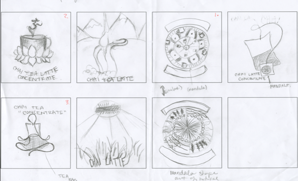

When I got to my second iterations I came to the idea of using ethos to show the consumer that you could in fact get more for your money then buying a latte at a coffee shop. I also had not thought of pathos being shown as relaxing and relaxing till my second iterations.
LOGOS:
I started out just sketching out different coffee cups and ways to render.

I came up with these pen and watercolor drawings to being my ethos packaging design:
 |
| ink and watercolor of cafe latte |
 |
| ink and watercolor of tea cup |
At this time I was thinking I was going to use both of these images to show logic, that in fact you would get "more for your money." I wanted to juxtapose the latte bought at a coffee shop and the at home experience of making your own chai latte for a lesser cost.
 |
| text iteration in print |
After deciding I was of course going to use these hand-rendered elements, I thought it would be a good idea to use hand written text.
 |
| text iteration in print and cursive |
Along with the text, I created baners to house my titles and such. I iterated how many ribbon peices I would have, color, and the "tails" of the ribbon


 |
| Iteration #1 |
 |
| Iteration #2 |
PATHOS:
At the beginning I wanted my pathos packaging to show the feeling of relaxing and calmness when drinking this tea. I decided to create mandalas to show this.
I went through a number of iterations with color, symbolism, and shapes of the mandalas.
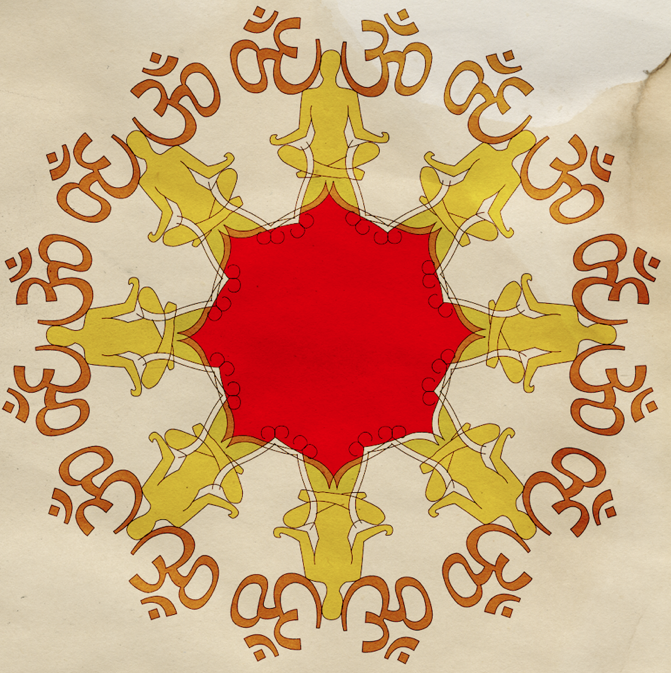 |
| began to use the "ohm" symbol within my mandala |
 |
| Iteration using a tea cup within the mandala Still working on the mandala I began to work with type. At first I tried the hand written text. But then decided use vectored type would be best for this packaging. |
 |
| Iteration #1 |
 |
| Iteration #2 |
FINAL
Making it to a definite choice I created two packaging designs that portray the the logos and pathos modes.


BTW: Blogger totally messed up my format :(
22 October, 2010
VIS LANG | Iteration, Pathos/Ethos/Logos | Packaging
Coming close to the final for our product packaging.
This was the product I went with, Oregon Chai Latte Concentrate. Which was categorized as logos. My task was to redesign the packaging and demonstrate ethos and pathos.
(As you can very well see this is THE ORIGINAL packing for the chai tea) ;)

For ethos I went with an economical approach. Saying that for your cafe chai latte (Like at Sbux), you could get this chai concentrate that creates eight cups for the same price. Well actually in the examples I will be show you, I have much more then eight cups shown. So, that of course it something I need to look into and change. I also am going to look into having the price written on the packaging. Okay, so Ethos:


This is just an ideal of what my final picture will look like with the right packaging. This of course is not the final by any means, but it is making it's way. Everything on this package was originally hand drawn then vectored on the computer.
For Pathos, I was going for the feeling of calming, meditation like, zen. This on has a long way to go. My colors are off, content needs to be thought out within the mandala. The type needs to be vectored, no hand rendered text. But it will look good soon, I promise ;)


These colors are far too similar to my other packaging. The text is off too. Bleh..
I'll get it!
Subscribe to:
Posts (Atom)
