11 October, 2010

VIS LANG | Progress

Messing around with type on my scanned imagery. This type is totally wrong, just mostly looking at the type's color on the paper.

Another messing around moment. I was going off the concept of a person meditation, the string of the tea bag emphasizing their features. VERY ROUGH. 

I wanted to use mandalas to show calming, and meditation like, to give the feeling that this tea was calming, and relaxing. I would use tea bags (as shown) and possibly teapots and tea cups inside the mandalas.
But after the crit I realized I can't use tea bags. Because the product is chai concentrate. So it's not tea bags, it's liquid.


A few paper tests I did, then used ink... just a thought.

PATHOS
 (calming, meditation, soothing, concentrate)
ETHOS
(more for your money and using the USDA ORGANIC logo)


This is a picture I drew Karen. I thought she should try this approached for her Neutrogena facial bar. Pretty good idea, right? Haha

08 October, 2010

VIS LANG | McCoy Lunch Lecture

What I learned: Well as simple as it sounds I learned how important it is to incorporate user experience within design.
As a designer I believe I do take a step into thinking about what the user's input would be. But I enjoyed how McCoy really emphasized it. 
He had different steps one could go through when designing. Very helpful, and something to try more often.


Just points McCoy mentioned: 

People Centered Design
and Modern Experience

What role do this products take, how do they interact with people's life? How do they use these technologies?

Start from the experience of the user. 

activities, environment, interaction, objects, users
Asking the questions, staring at the wall in the studio and just thinking about it, or actually go out and do it. Better user experience. 
cognitive mapping; how people view their space. Get on paper about how the person views their space. 

06 October, 2010


The first few pages are of my first round. Then there is the second round below. Honestly, I have not fully grasped the direction I am going to go with 
Trying to decide what would be the best direction to go in, the baby wipes, almond butter, or the chai latte concentrate. 
My next step is going to do some sort of a matrix. to further decided on my subject, and think of ideas that wont be so obvious and interesting.


Oregon Chai Tea Latte Concentrate

Pathos: 
1) Going off the concept of being comfortable and relaxed, while drinking a cup of chai tea. Like in a cafe setting, or in your own home by the fire.

2) Second concept is the feeling of being peaceful and healthy, example is of a person doing yoga poses is shown above.

3) The last concept of having the viewer feel like they are actually in the region where the chai tea originally was grown. The examples above show being in the mountains, or have rows of chai plants.

Ethos:
1) First concept would be playing off the trust of the USDA ORGANIC logo on the packaging. Emphasizing all natural traits, and the "certified" sticker"

2) Emphasizing that this product is concentrate. More for your money. 


04 October, 2010

NA | Logo Progression

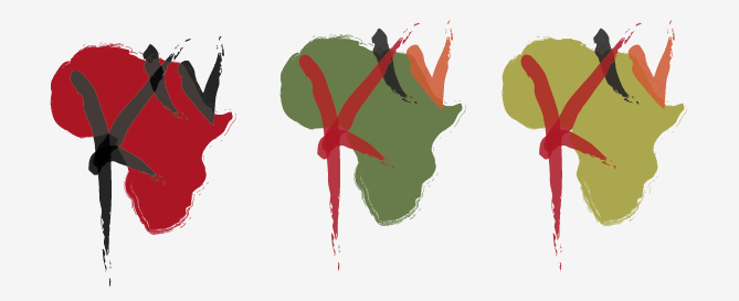
I have been working on the logo for Kibera TV. I am leaning towards the lettering with the circle or Africa shape. With the color I have been trying to use similar colors to Kenya's flag, and colors that relay to Africa. As far as the painting/handmade/drawing feeling, I was continuing the idea of these youths creating something, creating this community broadcast.

Also had tried using a TV image and just the letter K. Not my favorite. Ha.

03 October, 2010

NA | Combined Narrative


Project 5; Kibera TV from Loren Cook on Vimeo.


Final presentation for my combined narrative. I shortened each music clip to make sure they fit into the 25 second stop animation. I also added different colors to some slides, and repeated a few. This was to make the animation seem as it was moving to the beat of the music.
I think overall the two pieces fit pretty well together.


WHAT I HAVE LEARNED FROM THIS PROJECT:
As far as editing the sound and image, I don't believe I learned much more then before project 5. But when it came to editing these two pieces together, I had to really push to make it interesting. I could have easily placed these two channels together and made it work without much editing. But honestly, it was boring and expected. All in all I learned that combining two separate channels to make something interesting takes more time, but turns out so much more pleasing.

26 September, 2010

VIS LANG | Reading

TYPE AND IMAGE by Meggs, p. 130
Graphic design can enhance communication when using decoration. Using this decorative elements allows the viewer to greater experience the design.
The bauhaus movement produced a typeface that was simplified and appropriate to that movement. The typeface did not use serifs, had clean proportions, and was based on geometric elements.

When using argumentative writing your goal is to persuade the listener that your ideas are more valid then theirs. There are three basic means of persuasion: Ethos, Pathos, and Logos


ARISTOTLE'S APPEAL
Ethos: (or ethic appeal)
Convincing the audience to believe what the author is saying. Someone we respect and trust their word. As well as being likable and worthy of their respect.


Pathos: (Emotional): To persuade the listener by appealing to their emotions.This can also effectively be used to enhance an argument.


Logos: (Logical) To persuade by reasoning. Discussing what makes it effective and reasons to back up your claims.

25 September, 2010

Narrative | Detailed narrative #2

Sorry this is late coming. Soundcloud was having difficulties uploading. Finally figured it out ;)

This is my 2nd detailed narrative for Kibera TV. I was using sound to communicate to describe a small portion of Kibera TV, their culture. I chose to use clips from Kibera's local radio station, Pamoja FM. I really enjoyed making this clip. Their music is so lively and interesting. Occasionally I listen to the clips I have of their music, on my itunes. Haha

 Cook NA project4 by lcook

23 September, 2010

For Folly poster project I chose Karrin Allyson to promote. Research begins.

Karrin Allyson
Karrin (CAR-rin) Allyson is a three time Grammy-nominated American jazz singer and pianist. Allyson was born in Great Bend, KS and was moved to California, then returned to the midwest where she studied classical piano and sang at her local church. She attended the University of Nebraska at Omaha on a classical piano scholarship. Early in her career Allyson was lead singer for a rock band, Tomboy.
She soon developed a love for jazz, and performed in the jazz swing bad, and gigs around Omaha. She was inspired by Joni Mitchell, Norma Granz and Carol King. 
After graduating from UNO with a major in Classical Piano and a minor in French, Allyson moved farther South to Kansas City. This is where she recorded her first self titled album. The album that would catch Concord Record’s attention. Becoming part of the Concord label Allyson would go to release 11 albums. These albums include a mix of jazzy tracks that incorporated genres of bossa nova, blues, soft rock, pop standards, and folk rock. These diverse albums also included her playing the piano. She recorded a number of pieces which she sang in English, French, Portuguese, Italian, and Spanish.
Allyson now resides in New York, staying with the popular jazz scene but enjoys traveling all over the world. 

Descriptive Words:

Sexy
Fearless
Smokey
Dreamy
Diverse
Sensual
Cultured
Tender
Strong
Heart-filled
Grit


T
The beginning of this project was the difficult for me. We created a large analog concept matrix, using the tropes we studied earlier in the class. (e.g. pun, allegory, irony, metonymy) 
This exercise was very helpful. Allowed us to think broadly about our jazz artists, and what they were all about.
After going through two of these large matrixes, I came up with this metonymy (an indexical image of one thing to stand for another thing) Having a microphone turn into a bird. The micro phone stands in for showing that she is a singer/songwriter. The bird represents her as being graceful, elegant, and that her music has a lot of flow. Only made sense to me to have them morphing into one another.


This is my second iteration of the morphing microphone. I was still working on the form of the bird and making the middle step look accurate. I was also still using the vertical approach.


I then decided to use a older looking microphone. Mostly because she had that classic feel to her voice. Very timeless. Many, many vectored iterations.


I finally get to the diagonal orientation. I began to incorporate color and pattern.


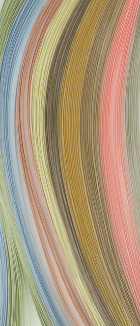
I discover these thin strips of colored craft paper. At first I use them as a background.


I begin to look at different bird orientations. Working on the form of my bird.


Many analog iterations created.


Use the colored craft paper in different directions and shapes. And start to use filters and overlays to change the hue and detail.


I have now decided on a color palette. and used the colored craft paper in masks behind my morphing birds. I have now began to make my bird and microphone look correct.


My final poster was reduced to mild colors and masked smoky images behind my morphs. I have included a detailed shot to show the paper texture within the background.

20 September, 2010

NARRATIVE | Understanding Comics reading

Understanding Comics, pgs 60-73

In the reading it discussed the importance of interaction between the viewer and how the viewer creates closure. Closure is key for the viewer and has great significance when using time and motion. Which is important when creating a narrative. There are many different transitions that create closure to the viewer:

Moment to moment
aspect to aspect
scene to scene
subject to subject
action to action
aspect to aspect
non-sequitor

These transitions are used between scenes of the narratives. These transitions in the narration help the viewer understand the parts that aren't actually shown.

17 September, 2010


The last one in this set is the one I chose for my full color. I feel they are all too busy. I have a layering problem. Ha.
I really like using the paper photos masked into the design behind the birds.
I had decided to fill the birds with a color, solely because you could hardly see the birds with only the outlines.
I really enjoy the colors, except the first one. I had placed that one up because I was showing another way I thought about rendering the background design. I really don't think it was working. And that yellow is just gross. Ha. You can also see where I tried to fill the birds with a transparent fill. I thought this would help not make them so solid, didn't really work.

TYPE III | Tender Buttons Book


Final photos of my Tender Buttons book.
I rearranged the poem by keeping the poem in a grid pattern and using vellum to break up text. This allows the viewer to change the words and phrases around by lifting and replacing the overlay.
I binded the book by perfect binding. It is a note flip book kind of style. Something to look up close and read.