17 September, 2010
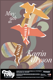
The last one in this set is the one I chose for my full color. I feel they are all too busy. I have a layering problem. Ha.
I really like using the paper photos masked into the design behind the birds.
I had decided to fill the birds with a color, solely because you could hardly see the birds with only the outlines.
I really enjoy the colors, except the first one. I had placed that one up because I was showing another way I thought about rendering the background design. I really don't think it was working. And that yellow is just gross. Ha. You can also see where I tried to fill the birds with a transparent fill. I thought this would help not make them so solid, didn't really work.
Subscribe to:
Post Comments (Atom)


Chris mentioned to me today that he thinks the paper in the lower two shapes have a bit of an Easter Egg effect. I agree.
ReplyDeleteP.S. There's nothing wrong with using layers - so you don't need to avoid them - just finesse them.